Testimonial Slider Using JavaScript
Hello Friends, Today in this blog you will learn How To Make Testimonial Slider On Website Using HTML CSS JavaScript.
In the earlier blog, I have shared to create Basic Login Form in PHP with MySQL database connectivity, Now it's time to learn How To Make Testimonial Slider On Website Using HTML CSS JavaScript.
In this blog we learn How To Make Testimonial Slider On Website Using HTML CSS JavaScript.
So Here is the code and my work. I hope you are gonna love this and share whit your friends too. So let's Start learning create a Testimonial Slider Using HTML CSS JavaScript from scratch. So Let's start..
Video Tutorial
STEP 1: Open any code editor
STEP 2: Create a index.html file with html extension
STEP 3: Create a style.css file with css extension
STEP 4: Connect style.css file to the index.html file code below
<link rel="stylesheet" type="text/css" href="style.css">
STEP 5: Create a main.js file with js extension
STEP 6: Connect main.js file with index.html file code below
<script type="text/javascript" src="main.js"></script>
STEP 7: Add this Code in index.html page
 <!DOCTYPE html>
 <html>
 <head>
      <title></title>
      <link rel="stylesheet" type="text/css" href="style.css">
      <meta name="viewport" content="width=device-width, initial-scale=1.0">
 </head>
 <body>
 <div class="hero">
      <h1>Customer Review</h1>
      <div class="main-box">
           <div id="slide">
                <div class="card">
                     <div class="profile">
                          <img src="images/gallery-1.jpg">
                          <div class="content">
                               <h3>Manish Mahato</h3>
                               <p>Web Design</p>
                          </div>
                     </div>
                     <p> Lorem ipsum dolor sit amet, consectetur adipisicing elit, sed do eiusmod tempor incididunt ut labore et dolore magna aliqua. Ut enim ad minim veniam, quis nostrud exercitation ullamco laboris nisi ut aliquip ex ea commodo consequat. Duis aute irure dolor in reprehenderit in voluptate velit esse cillum dolore eu fugiat nulla pariatur.</p>
                </div>
           </div>
           <div class="control">
                <img src="images/upload.svg" id="upArrow">
                <img src="images/down-arrow.svg" id="downArrow">
           </div>
      </div>
 </div>
 <script type="text/javascript" src="main.js"></script>
 </body>
 </html>
STEP 8: Add this Code in style.css page
 *{
      padding: 0;
      margin: 0;
      box-sizing: border-box;
 }
 body{
      font-family: sans-serif;
 }
 .hero{
      width: 100%;
      height: 100vh;
      background-color: #000;
      display: flex;justify-content: center;
      flex-direction: column;
      align-items: center;
 }
 h1{
      color: #fff;
      font-size: 30px;
      position: relative;
      margin-bottom: 20px;
 }
 h1::after{
      content: "";
      width: 150px;
      left: 50%;
      top: 100%;
      height: 3px;
      background-color: red;
      transform: translateX(-50%);
      position: absolute;
 }
 .main-box{
      width: 90%;
      max-width: 700px;
      height: 300px;
      background-color: #fff;
      position: relative;
      overflow: hidden;
      border-radius: 5px;
 }
 .card{
      height: 300px;
      background-color: red;
      padding: 30px;
      position: relative;
      line-height: 22px;
      z-index: 1;
 }
 .profile{
      display: flex;
      align-items: center;
 }
 .profile img{
      width: 70px;
      border-radius: 50%;
 }
 .card>p{
      text-align: justify;
      margin: 20px 5px;
      color: #fff;
 }
 .card::after{
      content: "";
      width: 110px;
      height: 110px;
      border-bottom-right-radius: 100%;
      position: absolute;
      top: 0%;
      left: 0%;
      background-color: #fff;
      z-index: -1;
 }
 .content{
      margin: 0 20px;
 }
 .content{
      color: #fff;
 }
 #slide{
      width: 100%;
      position: absolute;
      top: 0;
      left: 0;
      padding-right: 60px;
      transition: .5s;
 }
 .control{
      position: absolute;
      right: 0;
      height: 100%;
      top: 0;
      background-color: #fff;
      width: 60px;
      display: flex;
      justify-content: space-around;
      align-items: center;
      flex-direction: column;
 }
 .control img{
      cursor: pointer;
      width: 30px;
 }
STEP 9: Add this code in main.js page
      var slide = document.getElementById('slide');
      var upArrow = document.getElementById('upArrow');
      var downArrow = document.getElementById('downArrow');
      let x = 0;
      upArrow.onclick = function() {
           if (x > "-900") {
                x = x-300;
                slide.style.top = x + "px";
           }
      }
      downArrow.onclick = function() {
           if (x < "0") {
                x = x+300;
                slide.style.top = x + "px";
           }
      }
Step 10) Now Copy File Path and pate it any browser.
Step 11) See magic.....😊
Thank you...........
You can also read: How to creating an image slider using JavaScript HTML and CSS
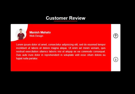
How its work
The Testimonials Card is Sliding Upward and Downward. In this Testimonials, cursors are available, Up arrow and Down arrow, clicking on which would slide the card.Testimonials using javascript.


0 Comments